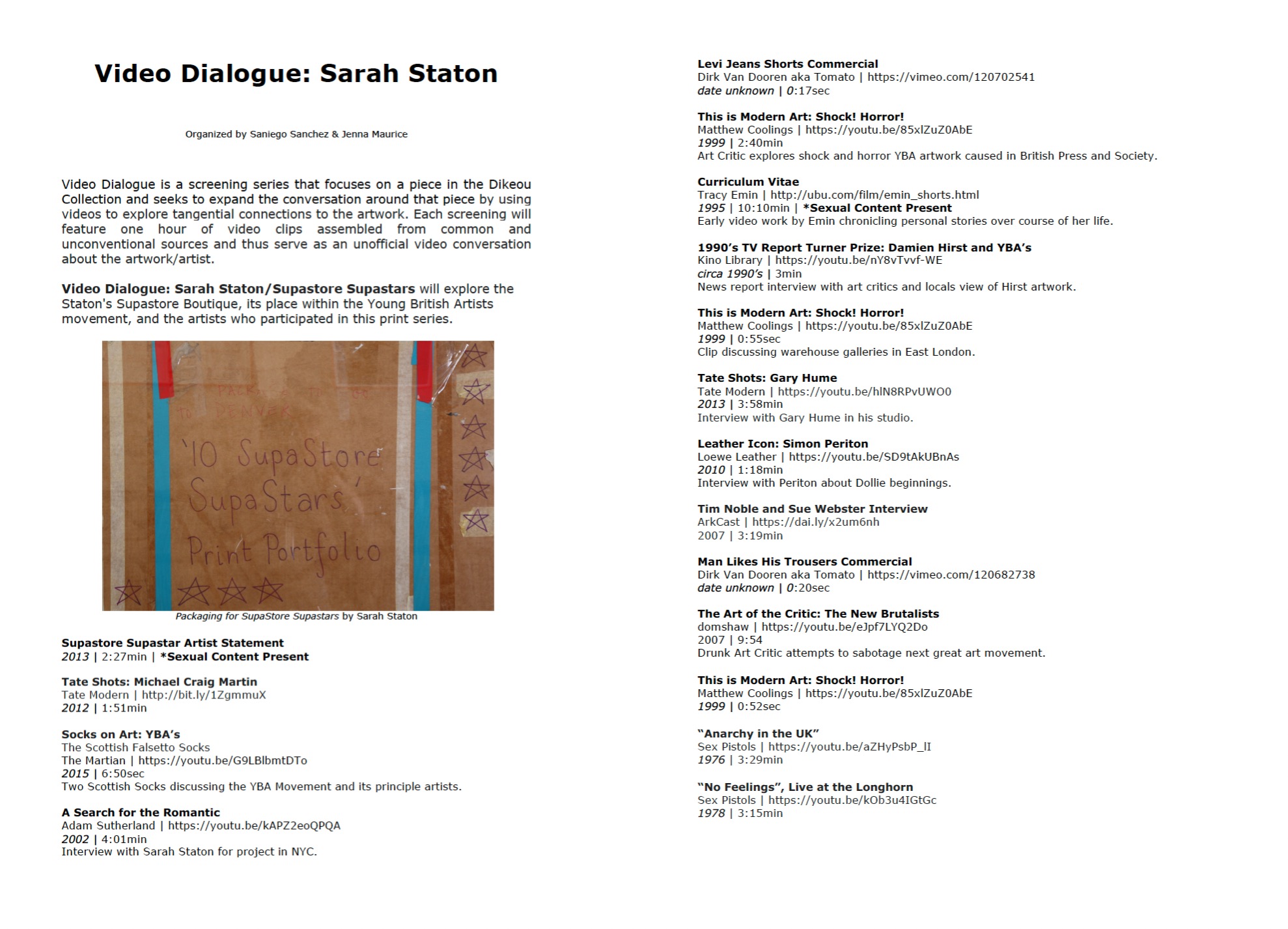
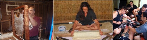
Dikeou Superstars: Lizzi Bougatsos
To speak about the artwork of Lizzi Bougatsos is to speak about Lizzi Bougatsos herself. Multidisciplinary, punchy, and ephemeral, Bougatsos’ art is the child of an urban wasteland. The world is her oyster and her apartment is her studio. Her visual art is conceived in short bursts: give her a month and she will give you an art show. Bougatsos is a performer by nature, which means that being a fashion icon and noted queen of the underground is a part of her art practice. It is impossible to find an article about her that leaves out the fact of her sweet witchy vibes and her celebrity friends. She works quickly, touting a plethora of different art works and collaborations, often made with found objects and smashed together with the brilliance of a quick wit. Bougatsos is most known for her performative capacity both in her musical work with bands Like Gang Gang Dance and I.U.D., her performance art at venues such as the Museum of Arts and Design in New York and the Whitney Museum of American Art, as well as her sculptural work that is represented by James Fuentes Gallery in New York.
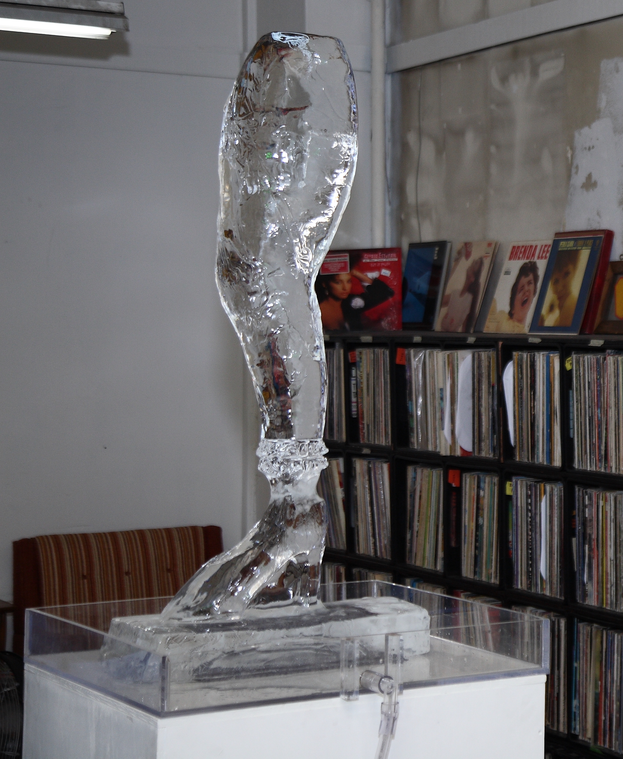
In both her zingchat interview with zingmagazine and her lecture for School of Visual Arts, she describes an encounter she had with artist Suzanne Anker that would come to define her personal philosophy of art. “She [Suzanne Anker ] said to me, ‘This is sculpture’ [throws a no. 2 pencil in an arc]”. This pedagogical moment was a profound one for Bougatsos’ career. In truth, the aesthetic and metaphysical tendencies of her art can be traced back to this juncture: that of performance and sculpture. For Bougatsos, there is no distinction between those two mediums. A sculpture is just performance over a longer period of time. Each physical part of the object takes up space in a particular place for a particular moment in time be that the movement of a dancer’s body, or the time it takes for a material to disintegrate. Self-Portrait (2012) is a mold of the artist’s leg cast in ice which slowly melts as it is put on display in a gallery setting. The sculpture becomes a personal performance in destruction; Strange in its disembodiment, and beautiful in the natural slowness of its change from one state to another. Suzanne Anker’s observation about the nature of sculpture is so apt in describing Lizzi Bougatsos’ art not only in its philosophical implications, but in the fact of its humor. It suits Bougatsos’ style to have a story that is all at once funny, surprising and performative.
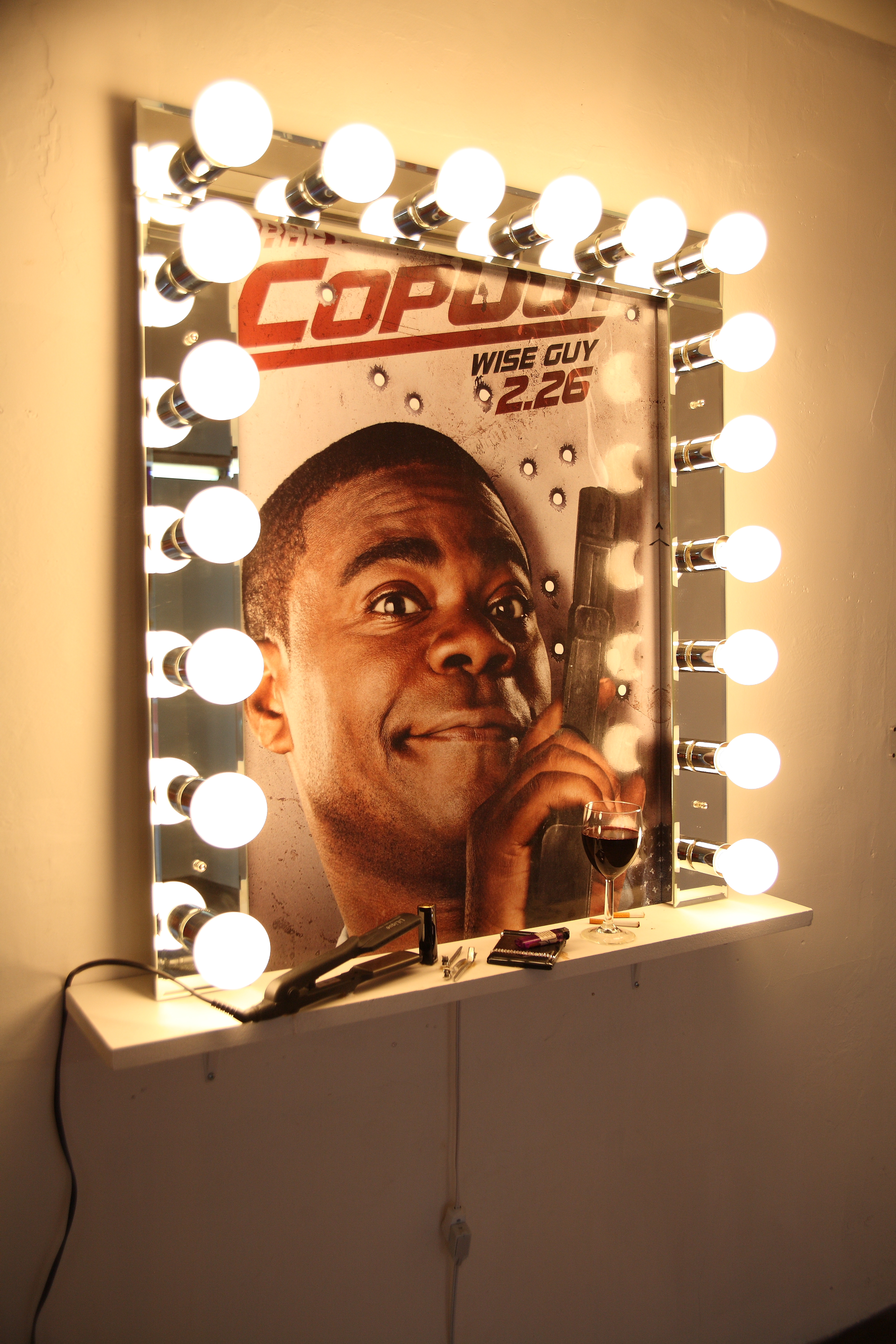
The Dikeou Pop-Up: Colfax location houses six pieces by Bougatsos dating from 2010 and 2012. Her piece Good Hair (2010) encapsulates these elements of humor, performance, and sculpture that dominate her art practice. The piece consists of a large stage-vanity scene with bright lights surrounding a frame. Where the mirror would be is a poster of comedian Tracy Morgan from his 2010 film Cop Out. Below the “mirror” is a shelf strewn with lipstick, a hair straightener, a half finished cigarette, a glass filled with red wine. As a viewer, the piece forces you to participate in the narrative of a person readying themselves for a performance. For a moment, you are the main character of the scene. You stand in front of the mirror and you laugh because for a moment you see yourself as the brashly funny Tracy Morgan.
Good Hair is a physically static art object, and yet it feels more closely related to a stage set than a marble statue. Bougatsos is able to soften the rigidity with which we usually see physical art objects. It is also important to mention that Good Hair is a self-portrait. Bougatsos considers herself to be a comedian: a purveyor of the same kind of Saturday Night Live, yo-momma defacing, character-driven humor that is associated with Tracy Morgan. Her art reflects a character wrought with celebrity. And yet, she is not the revered, godlike kind of celebrity, but rather the archetypal jester figure that asks for attention with an exposed tongue and thumbs in its ears.
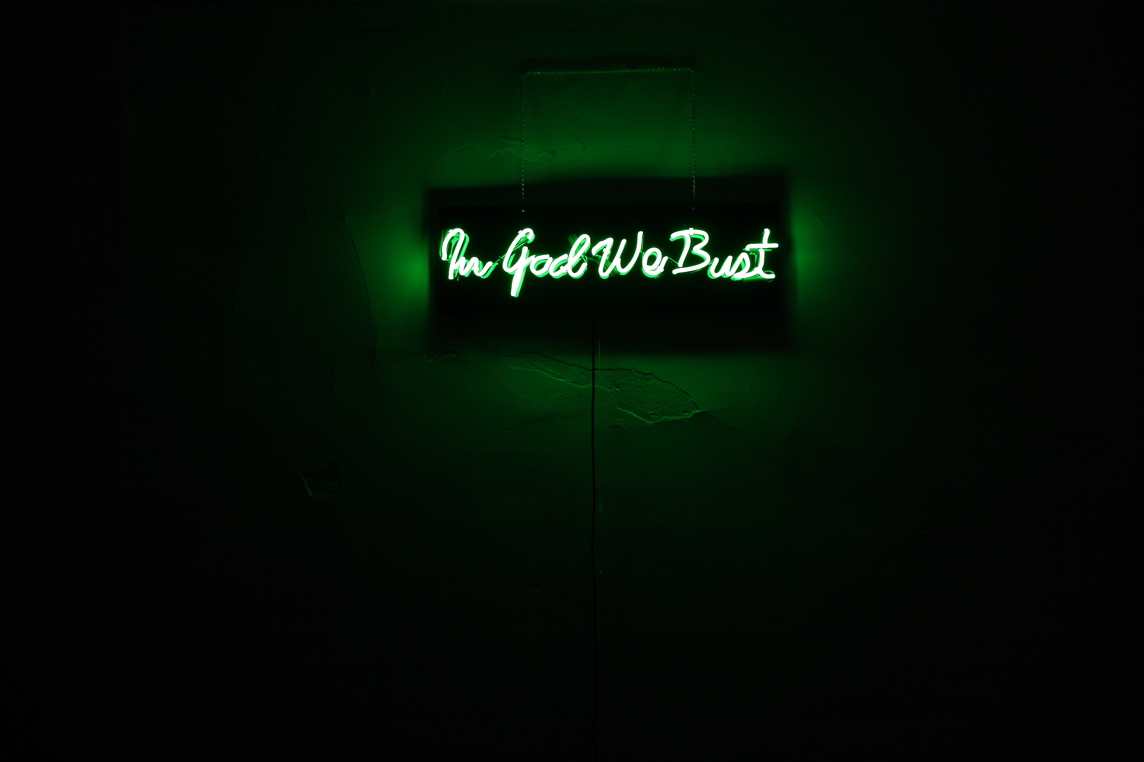
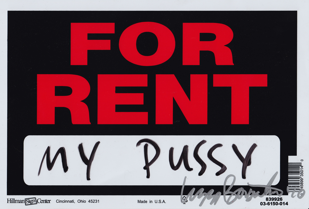
Indeed many of the Bougatsos’s pieces that reside at the Dikeou Pop-Up read as one-liners. Pussy For Rent (2010) consists of a For Rent sign with the words “my pussy” scrawled in marker on the blank space. Bougatsos makes a sort of feminist joke about her own genitalia being real estate in a world where women’s bodies are constantly being objectified. In God We Bust, also created in 2010, is a green neon sign that that displays those words. The piece references America’s catch phrase, satirized with pun, written in the medium of a late night city. The sign reads like a quip uttered in the wake of silence after political debate meant to tease out some laughs to ease the tension of the room.
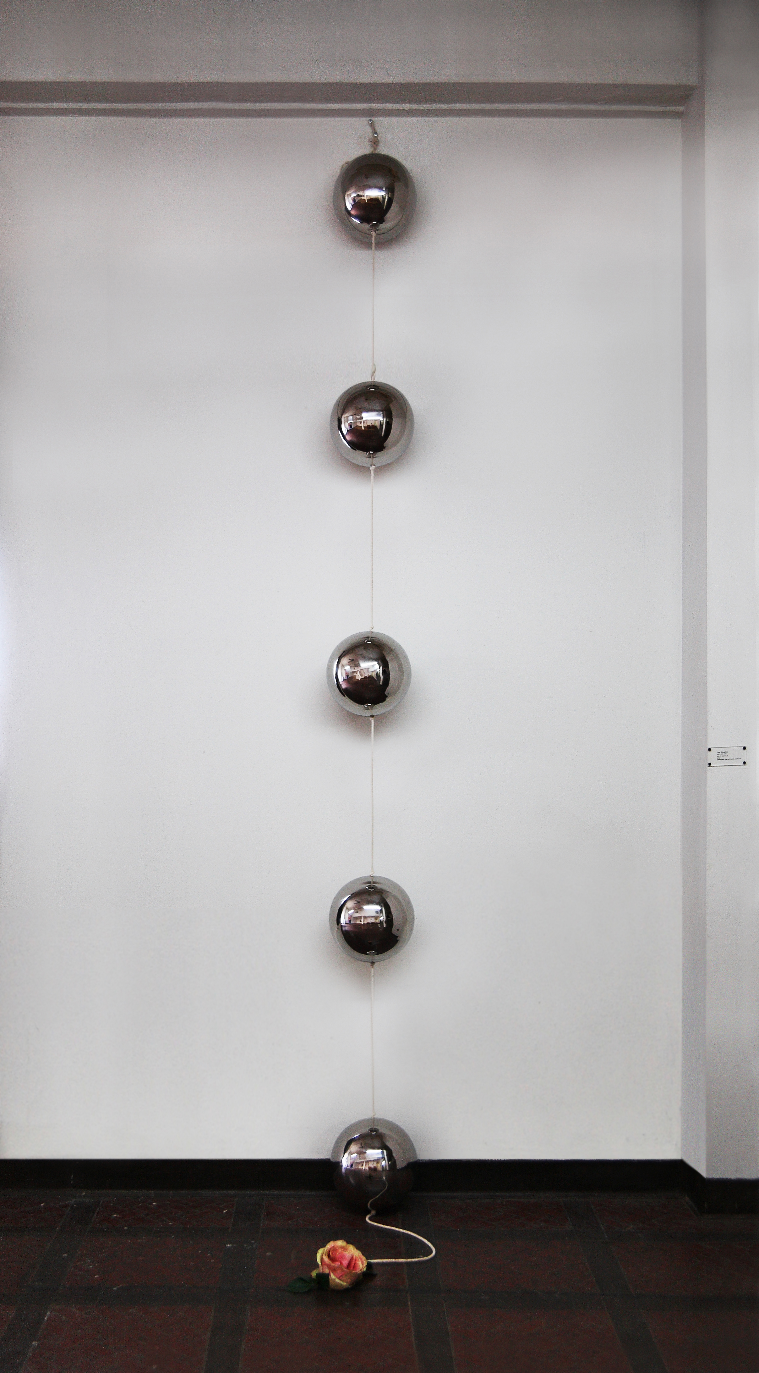
In Happy Ending 2 (2012) Bougatsos presents a large scale version of anal beads. Five large reflective silver balls are connected by a rope and hung from the ceiling. At the bottom a pink rose trails to the floor. This piece exemplifies the dichotomy between objects and their referential, societal meaning. The title of the piece and the rose component can be symbolically understood in more than one way. The saying “happy ending” conjures relations to both fairytale stories and sexual climax. The rose is a symbol of natural innocence and is also used as innuendo when related to taboo body parts. By changing the scale of a sex object Bougatsos allows the viewer to consider each part of the piece in the context of erotic imagery and also in a societal vacuum.
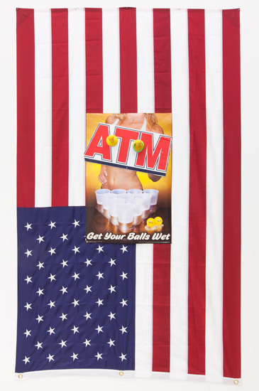
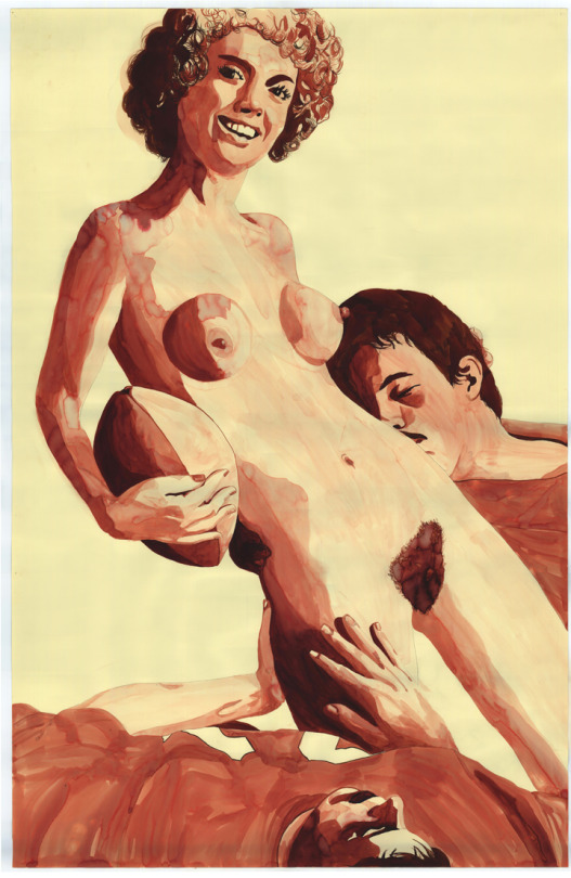
The pieces in the collection at the Dikeou Pop-Up also include the controversial Dick Toss II (2012) which involves an upside down American flag hung on the wall, overlaid by a poster depicting the body of an explicitly clad and faceless woman. She offers the viewer a game of beer pong and the caption reads “ATM: Get your balls wet”. Where the woman’s breasts would be, two toy sized dildos are placed with removable rings. The title invites the viewer to play a game, toss the rings and incriminate themselves in the overt sexual objectification that dominates American culture. Once again Bougatsos’s art is performative. Just as Suzanne Anker suggested, the second half of the sculpture is created when the viewer engages physically with the work, throwing the ring in an arc and playing a part in the performance. Thus we implicitly participate in the cringe-worthy imagery that Bougatsos’s wants us to admit to.
-Liana Woodward