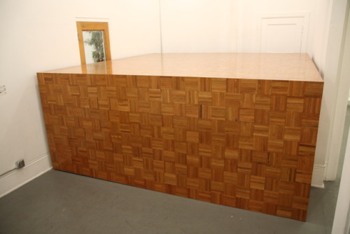
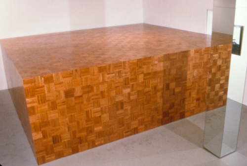
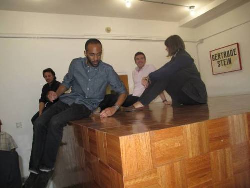
Recap: Visiting Critic Lecture: Ben Davis “Art and Class”
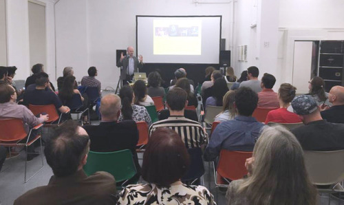
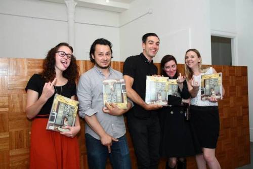
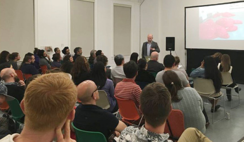
On May 12th, Dikeou Collection hosted a public lecture by New York-based art critic Ben Davis in partnership with Black Cube Nomadic Museum. Dikeou Collection serves as a relevant platform for a critic lecture as it offers a free space for the public to interact with art that encourages critical thinking and expression. This is the second time Dikeou Collection has partnered with Black Cube to present new and thought provoking ways for audiences to engage with art in Denver.
Founded in 2015 by artist and philanthropist, Laura Merage, Black Cube upholds the belief that art is an essential part of a vibrant, just, and healthy society. As a nonprofit, they exist by partnering with artist fellows to commission popup art experiences. They aim to nurture the self-sufficiency of artists and inspire people to discover and appreciate contemporary art beyond traditional white museum and gallery walls.
Davis is an art critic living and working in New York City. His book, 9.5 Theses on Art and Class has been called “a riveting manifesto” by New York Magazine and a “required reading for art professionals” by Publishers Weekly. Davis is currently National Art Critic for artnet News, and was formerly executive editor of Artinfo.com and an editor of The Elements of Architecture, the catalog of the 2014 Venice Architecture Biennale. His writings have appeared in Adbusters, The Brooklyn Rail, Frieze, New York, Slate.com, The Village Voice, and many other venues. Davis presented his ideas surrounding the intersections of art and class to a receptive and open-minded audience.
Davis spoke about the three definitions of class: economic, educational, and structural. While many of us are familiar with the first two, we may not all have knowledge of the third. Structural class refers to our positions relative to society. Unfortunately, art is “isolate[ed] … from the practical problems of the moment,” he says. Part of this may be because art is and has always been secondary to other things society deems more important.
Although more people work in creative industries now than they did forty years ago, art is a tough profession. Art programs in schools are the first to get cut when funding is tight, and most professional artists are not able to sustain themselves purely with their art. As a result, the art world is an exclusive luxury industry.
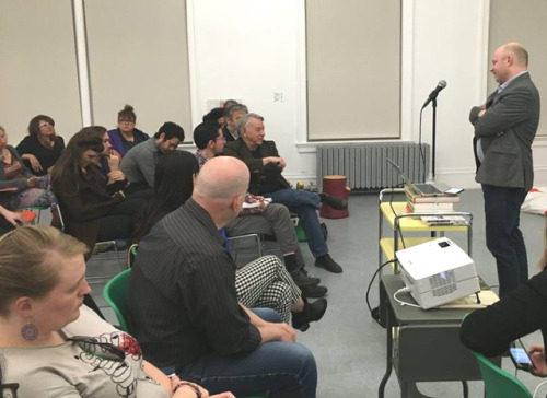
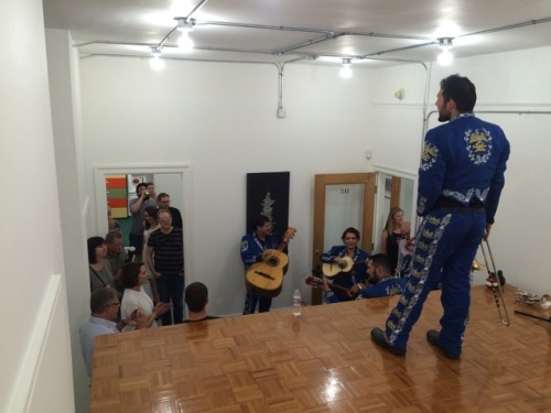
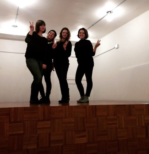
Over 60 people attended Davis’ lecture, including artists, curators, critics, and other professionals and supporters in Denver’s creative community. A great Q&A session followed where individuals talked about their own experiences in the contemporary art world and learned more about Davis’ role in the art community. Keep an eye out for more upcoming events at Dikeou Collection and Dikeou Pop-Up: Colfax.
- Aryana Hatami