Behind The Scenes of De-Install
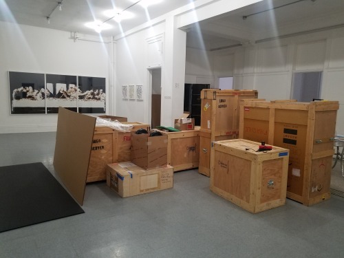
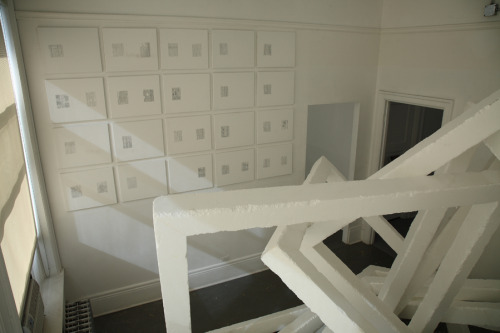
March 29, 2019 was the last day Dikeou Collection was open to the public, marking the beginning of the collection’s very first full exhibition rotation. Since April we have been hard at work de-installing, packing, and storing the work of 37 artists occupying 33 rooms and 2 buildings in preparation for the forthcoming Devon Dikeou Mid-Career Smearretrospective exhibition opening on February 20, 2020 at Dikeou Collection. If you have visited the collection before, then you are aware of the scope of this project and might be wondering how we handled some of our very large and complex pieces, like Johannes VanDerBeek’s Newspaper Ruined, Nils Folke Anderson’s Untitled (California), and Agathe Snow’s Sludgie The Whale. We can’t reveal all our secrets, but we are happy to share a little glimpse of some of what’s been going on behind the scenes here for the past couple months.

Dikeou Collection is known for being home to artwork that challenge ideas of space, scale, and material – objects that many would consider “difficult” to house and maintain. Johannes VanDerBeek’s Newspaper Ruined is arguably the most intricate piece in the collection, consisting of four large tables pushed together upon which a city made entirely out of newspaper rests. It took a lot of preliminary planning on how to go about removing and storing this dense and fragile installation.
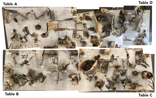
Many detailed photos were taken of every square inch of the work, documenting where each little piece sat in relation to another. Our art handler Dmitri developed a number-letter system to determine where everything goes on the tables, and then stored each piece in a box or tray labeled with the respective ID. It took over a week to complete!
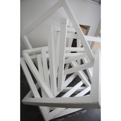
Untitled (California) by Nils Folke Anderson is a very large movable sculpture (so large you can’t even fully walk into the room it occupies) made out of nine interlocking Styrofoam squares. This piece was constructed in-house by the artist, so it didn’t come equipped with any original packing material or deconstruction method. Because of its large size, unpredictable mobility, and deteriorative nature of the material, we had to completely dismantle the work.
While this may seem like heresy, we did it in the most honorable way possible by communicating with the artist beforehand, documenting the process, and preserving leftover remnants of the work. What took a couple days to construct was disassembled and removed in a matter of minutes.
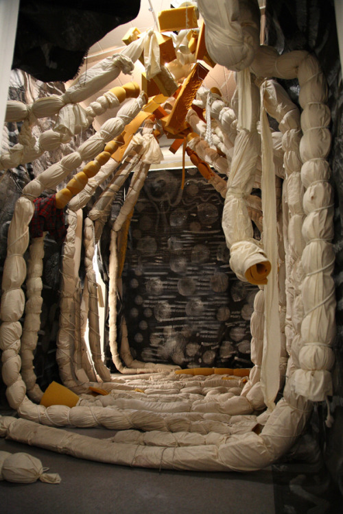
Agathe Snow’s Sludgie The Whaleis another large-scale installation that envelopes a whole room with painted tarps, foam rolled and wrapped in muslin, plastic, and wire.
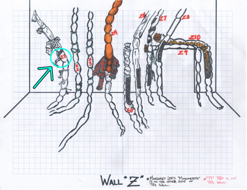
Like Untitled (California) this is another work that was assembled by the artist without specific instructions on how it all comes together, so our research assistant Hannah created a “map” of the work and developed an ID system similar to Newspaper Ruinedso we will know how to put it back together when we re-install the collection in a couple years.
One of the central tenents of Dikeou Collection is that all artwork remains permanently on view – exhibitions are not rotated but rather expanded – so de-installing the collection in its entirety is now a major chapter in its history. Soon we will begin the process of installing Devon Dikeou’s artwork for Mid-Career Smear, curated by Cortney Lane Stell, which will mark another milestone for us. It has been quite the journey leading up to this point and we can’t wait to share more updates with you along the way.
-Hayley Richardson